Bertucelli’s La Villa
This is a responsive redesign for Bertucelli’s La Villa’s website, a family-owned deli known for its sandwiches and handmade ravioli.
Project type: Responsive Website Redesign
Role: Sole UX/UI designer
Tools: Figma, FigJam, Zoom
Duration: 4 weeks, May 8 - June 10
Ravioli Anyone?
Bertucelli’s La Villa is a family-owned deli known for its sandwiches and handmade ravioli. The deli is really popular with the locals and is recommended for those who want to visit San Jose. While it has over 10k followers on Instagram, their website does not represent their welcoming environment.
Problem
Unresponsive design
Menu has no photos or clear descriptions
Menu is overwhelmingly large without a selection of most popular items
Frozen ravioli order form was unclear

Research Process
Goal:
I want to redesign Bertucelli’s website into a responsive, visually appealing site where customers can find what they’re looking for quickly.
Objectives
Understand what food enthusiasts look for when visiting a restaurant’s website.
Understand why regular and new customers visit a restaurant’s website.
Competitor Analysis
For my competitor analysis, I reviewed four local restaurants, Serious Dumpling, Must Be Thai, Omogari, and The Den’s Deli. I analyzed these sites to identify their strengths and weaknesses and improve Bertucelli’s menu.
Key User Insights:
Some strengths these sites have are menus sorted by categories and allergens, unique visual menu design, food ratings, relevant meal descriptions, including essential information like business hours, location and contact info.
Some room for improvement for the sites are adding an About Page to connect users with the business and including pictures and prices in their menus to make it easy for users to make a choice.
User Interviews
Research methodology:
5 remote interviews
Age: 25-30
Participants had experience with searching up restaurants and going on their websites
Participants were asked to look through Bertucelli’s website
Key User Insights:
Users prevent decision paralysis by looking for the top customer’s choices
Users look for pictures and meal descriptions when deciding on what to eat
Food categorization helps with organization and decision-making
Bertucelli’s website lacks pictures and meal descriptions, is not aesthetically pleasing, and their ravioli order form is confusing
Define
Persona
After gathering insights, I made a persona that depicts new customers who get decision paralysis.
Problem:
I’d like to explore ways to help first-time customers who look through menus on restaurant mobile sites to decide on what to order because they are overwhelmed by choices and don’t want to spend money on unsatisfying food.
How might we help new customers decide on what to eat while looking through the restaurant website menu on their phone?
Solution:
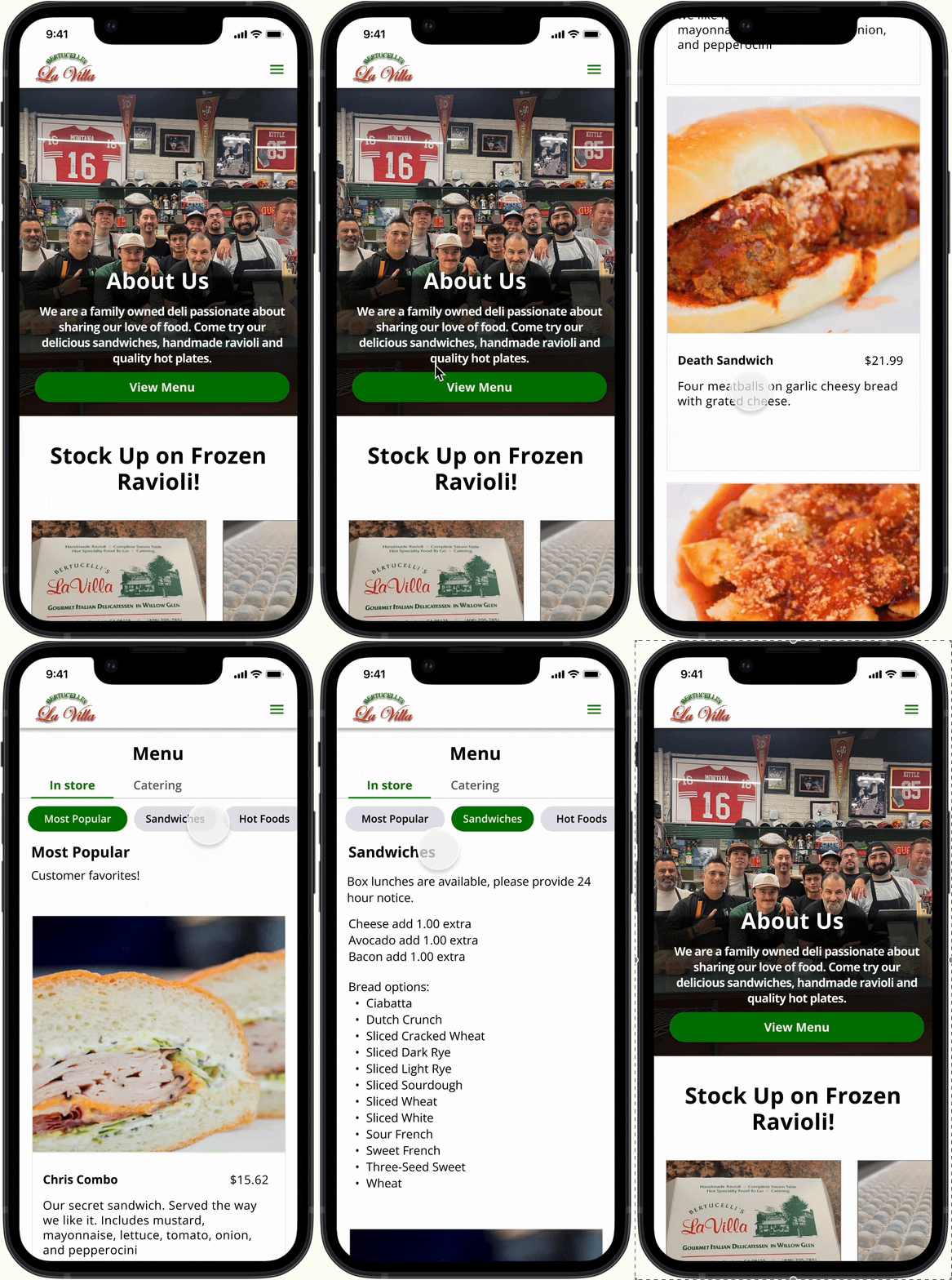
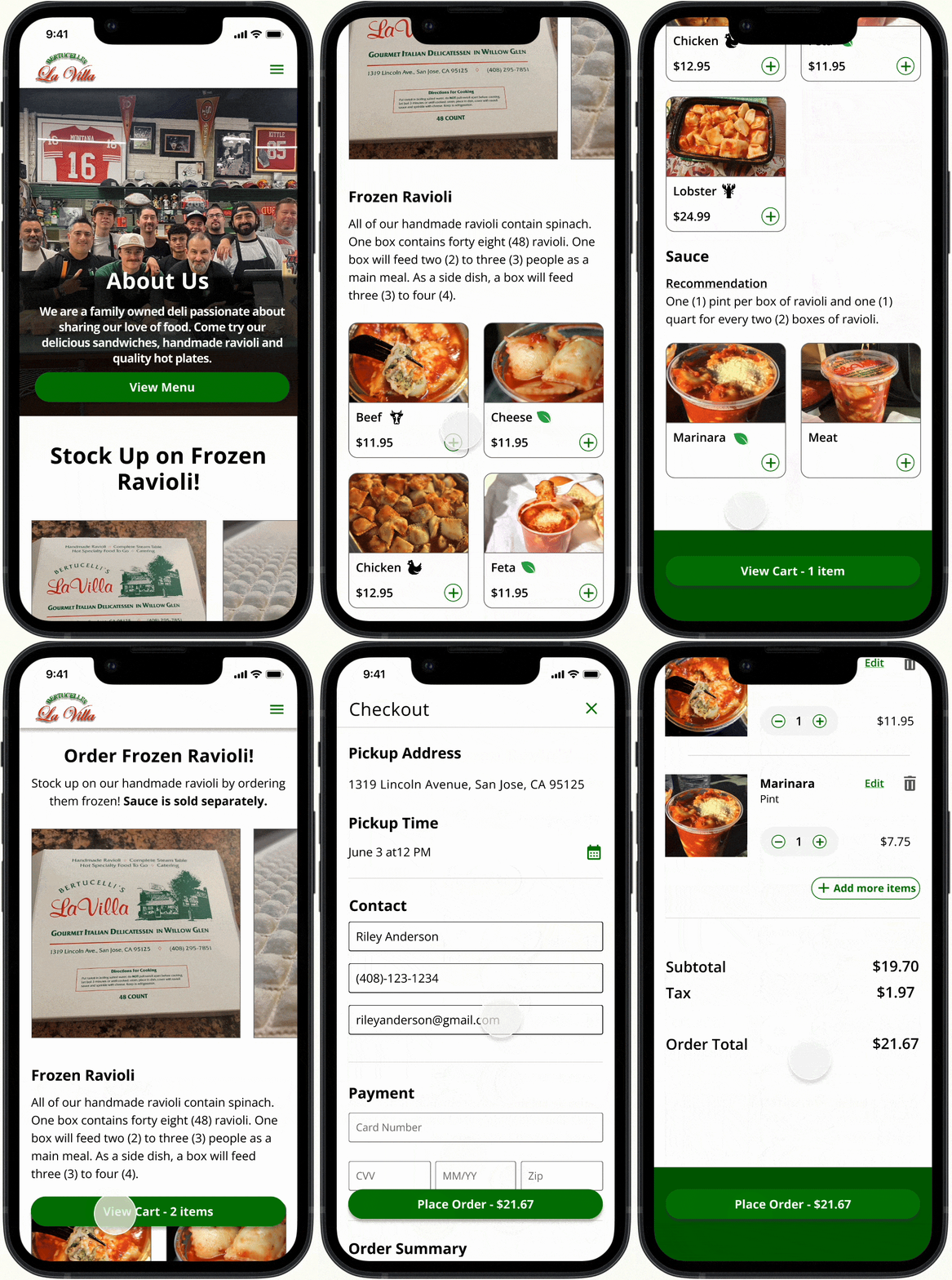
I redesigned Bertucelli's La Villa’s website into a responsive, user-friendly experience. The menu is easy to browse with visuals and clear categories, and the ravioli order form is intuitive. The redesign helps users make quicker, more informed decisions while driving more orders for the business.
Ideation
User Flow
Creating the user flow for ordering frozen ravioli and browsing the menu helped me visualize how the users would navigate through the site and check for potential issues during the process.
Design Process
I created low-fidelity, mid-fidelity and high fidelity wireframes and iterated them based on mentor feedback and usability tests.
Usability Test
Goal:
Identify users’ understanding of how to navigate the mobile website, find the menu, and order frozen ravioli without confusion.
Task:
Look through the menu
Order frozen ravioli
Insights:
The truncated card text reduced clarity for 2/5 participants, making it harder to make informed decisions and reducing visibility of the photos
The menu’s design pattern led 3/5 users to believe they were placing an order, which made the menu harder to understand
Not having allergen indicators would reduce confidence in decision-making for users with dietary restrictions
Not having a confirmation page brings uncertainty about whether users’ orders went through and if their orders were correct
Prioritized Recommendations:
Enlarge the cards to provide full dish description by default
Clarify homepage to show menu is not an order form
Include allergen information
Add a confirmation page showing total cost and edit option
Add labels to show ordered quantity
Iterations
Final Product
Task: Look through menu

Task: Order frozen ravioli

Conclusion
It was challenging to write user interview questions because restaurant websites seem straightforward, but there was a lot to learn from users, which helped me redesign Bertucelli’s website responsively. The menu and ravioli order form were prioritized, but the homepage helped clarify each page.
Challenges:
Usability tests produced many suggestions to consider, but I prioritized clarity of the menu so users could easily understand their options
What I learned:
Asking users to rate understandability and why they rate it is a great way to find insights in a usability test
What I could have done differently:
I could have reviewed more references to prevent the assumptions and confusion that led users to mistake the menu for an online ordering form

